 CHELSEA'S PORTFOLIO
L.A.B. Golf Spring Opener
PRODUCT GRAPHICS
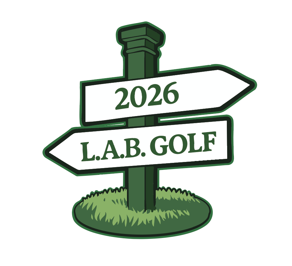
L.A.B. Golf Masters Launch 2026
It's funny how sometimes as a designer your biggest problem can be the overuse of a flower. At least, that was my biggest problem last winter break.
For all of the non-golf fanatics out there, let me provide some context. I was working on L.A.B. Golf's collection for the 2026 golf masters. It was my job to make the graphics for the putters, headcovers, and apparel. When I got put on this project, I was still the new designer on the block and the spring opener is the brand's largest annual launch.
Despite my eagerness to get my hands on the work, I immediately started to clock challenges.
The problem with designing for the Masters is that everyone knows what Masters merchandise is supposed to look like. Stray too far from tradition, and people won't recognize it. Stick too close, and you're making the same thing as everyone else.
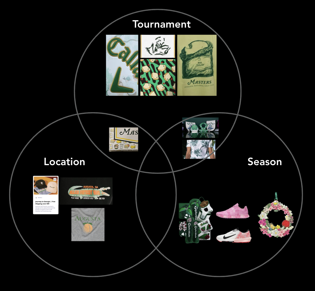
I started laying out my options by looking at what competitors had done and running a market analysis. I found that design elements typically fall into three distinct categories: season, tournament, and location. The key is finding the right balance of the three.
This is where my design process gained a new step thanks to a conversation I'd had the week prior.
I'd been chatting with my professor, David Ewald, picking his brain about how he stays inspired as a designer. He told me that he finds inspiration by looking for new ways to connect old dots.
So, I made a list. I ranked design elements used in Masters merch from most to least recognizable. The idea was that this would help me strike that balance between novelty and recognizability.
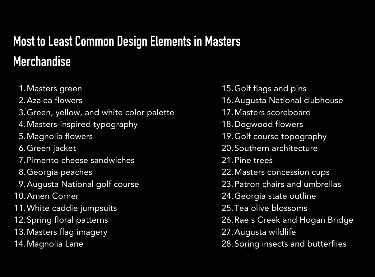
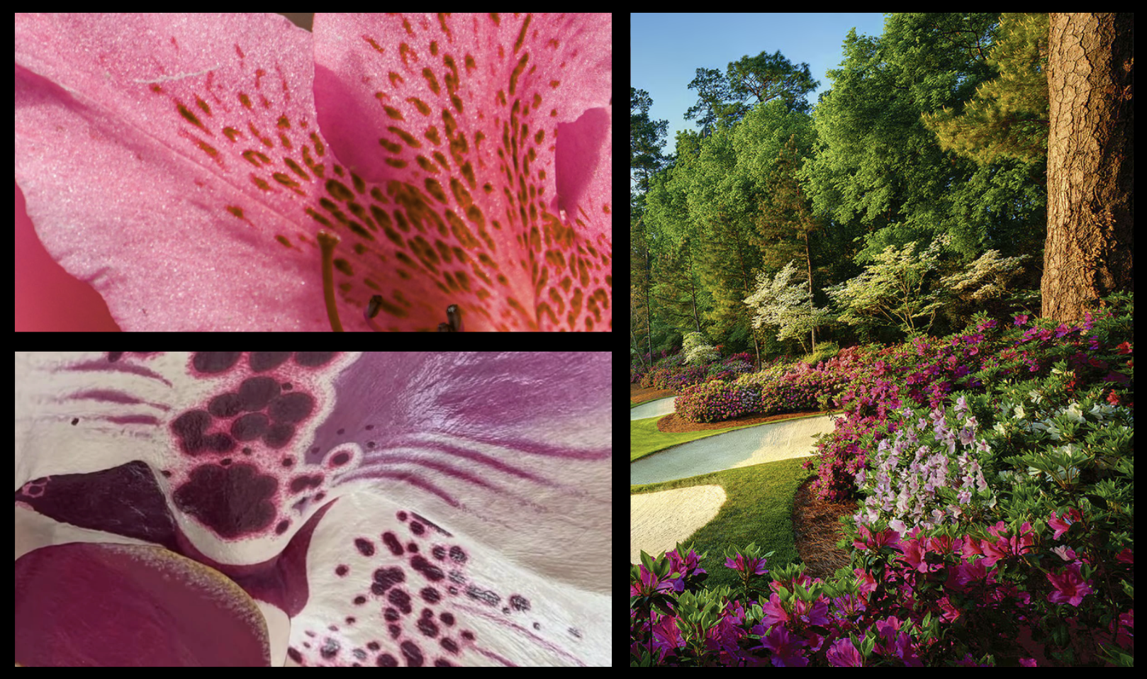
With my list in hand, I started looking for ways to show L.A.B. Golf's technical, premium, and slightly weird personality. Macro photography caught my attention because of its connection to biology and science.
Moodboard
After getting the general concept approved, I created some assets to pitch to the product management team. And boy howdy, did I get some helpful feedback.
My designs didn't immediately read as Masters products.
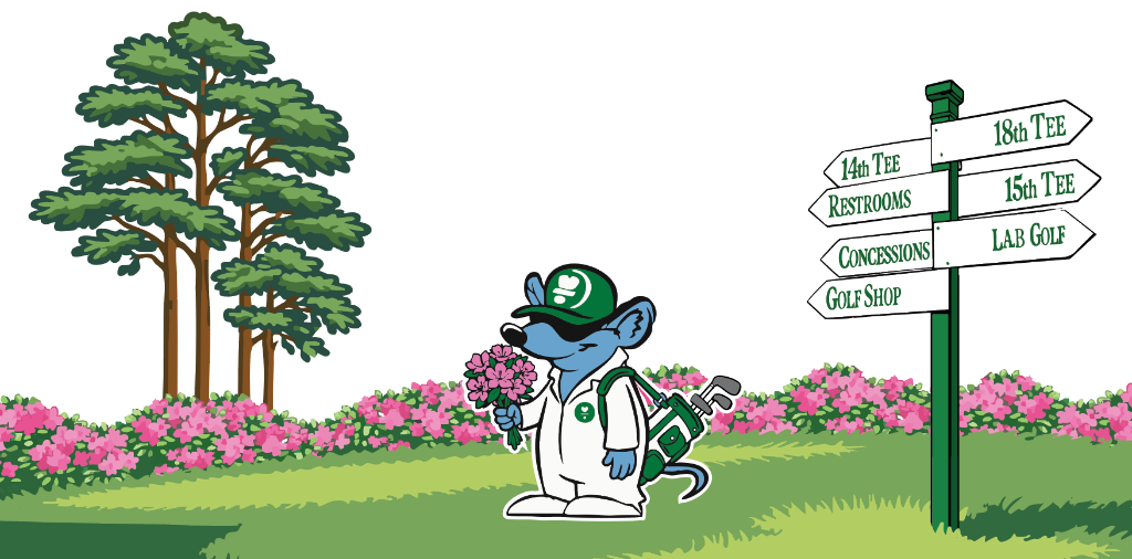
My pink floral pattern looked like a flower, but not necessarily an azalea. The team also wanted to see more of L.A.B. Golf's goofy personality come through in a subsection of the work.
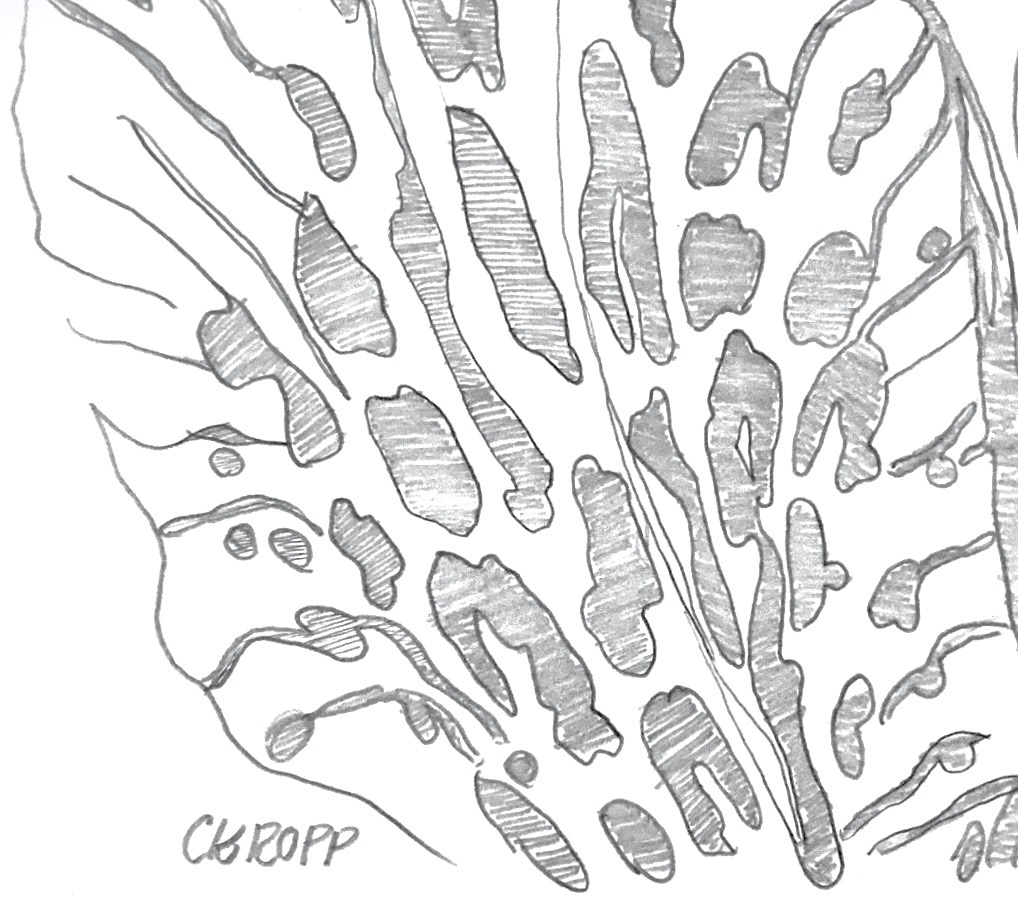
Initial Sketch and Pattern
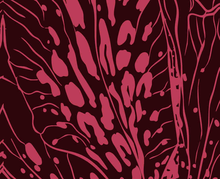
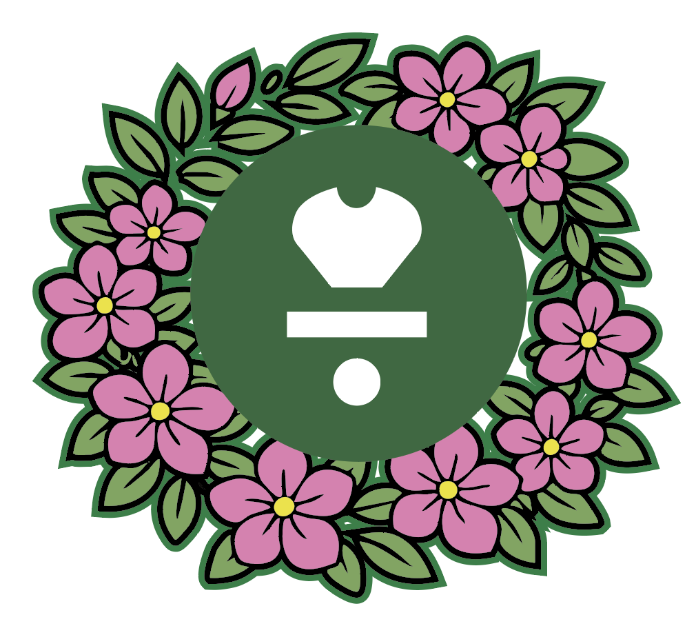
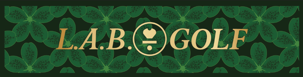
With that feedback in mind, I reworked my color palette, introduced tournament-inspired typography, and created an azalea logo to help make the floral pattern more recognizable.
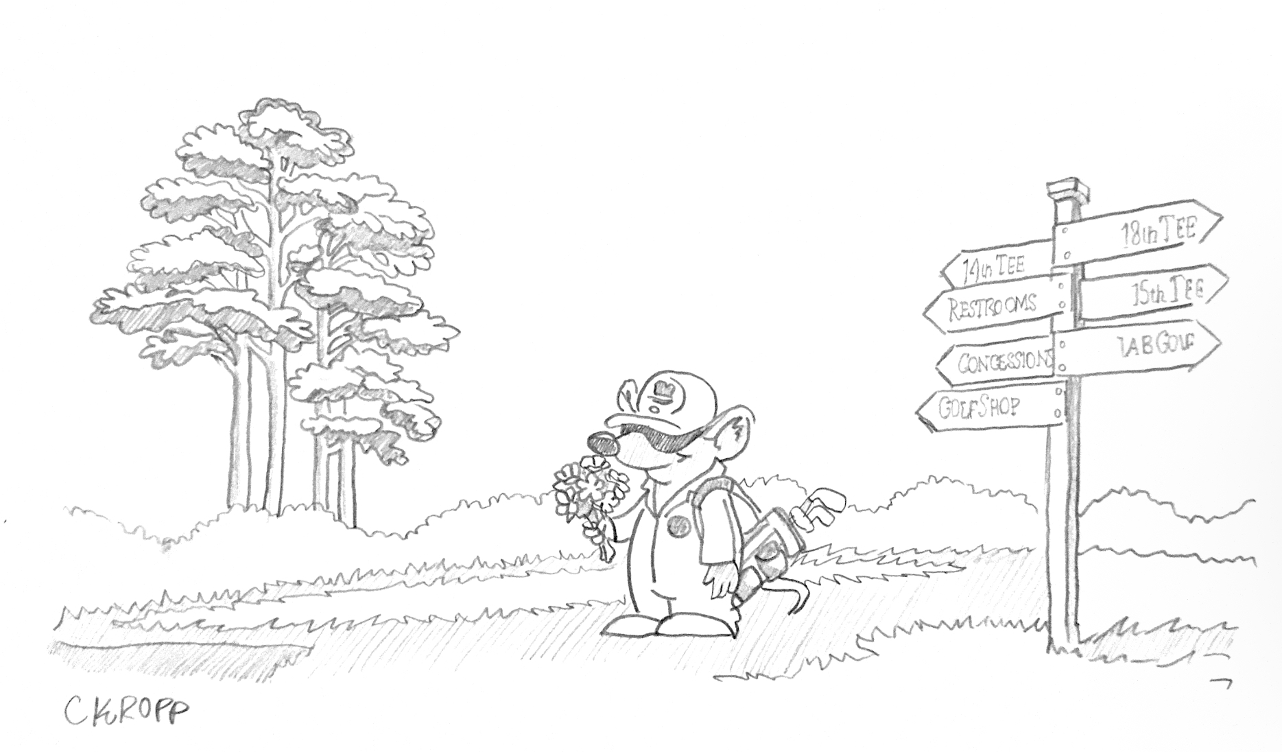
Making a playful design option
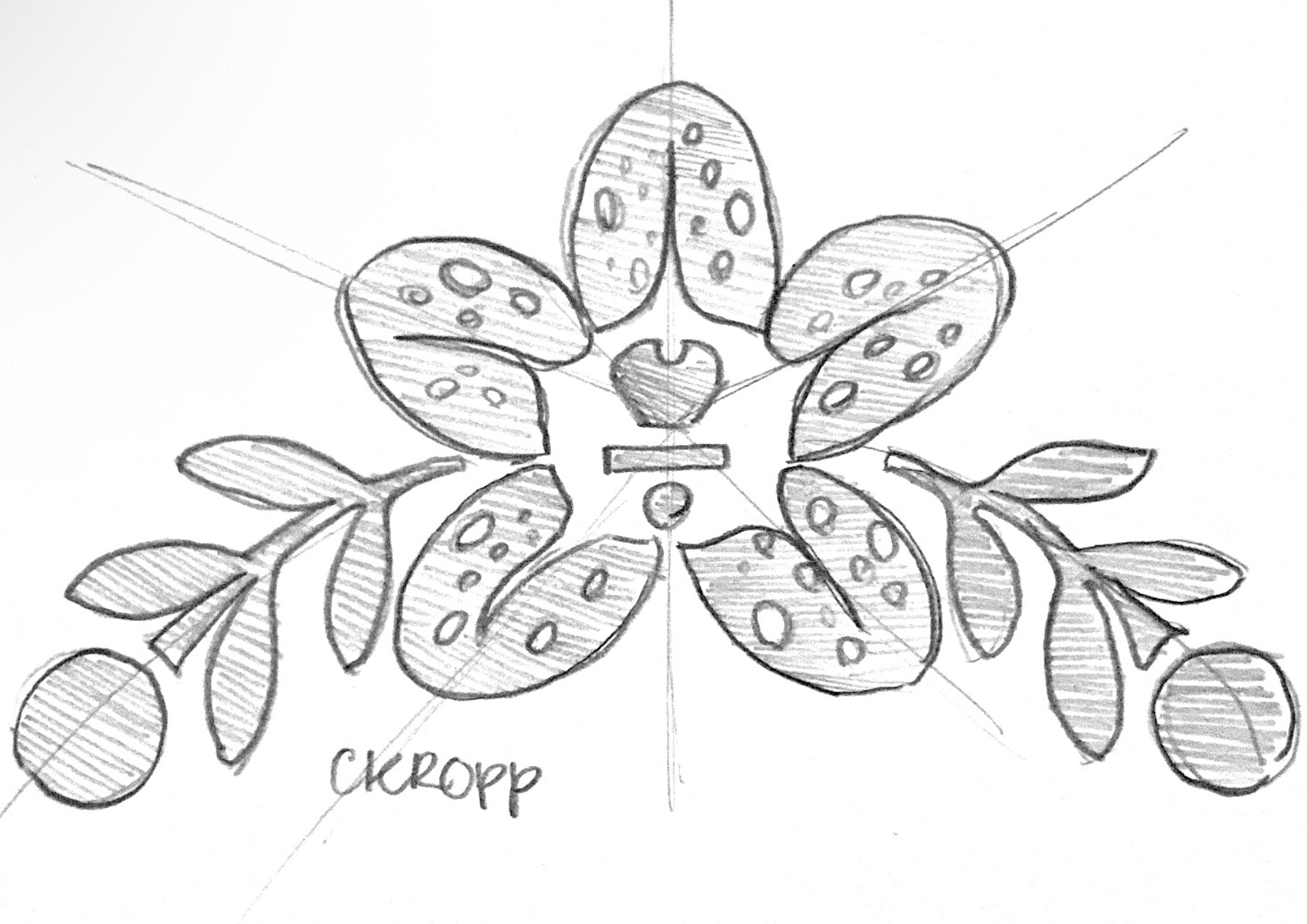
Azalea Logo
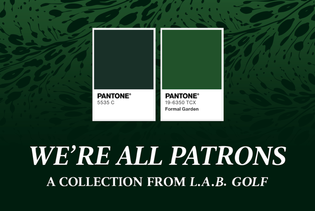
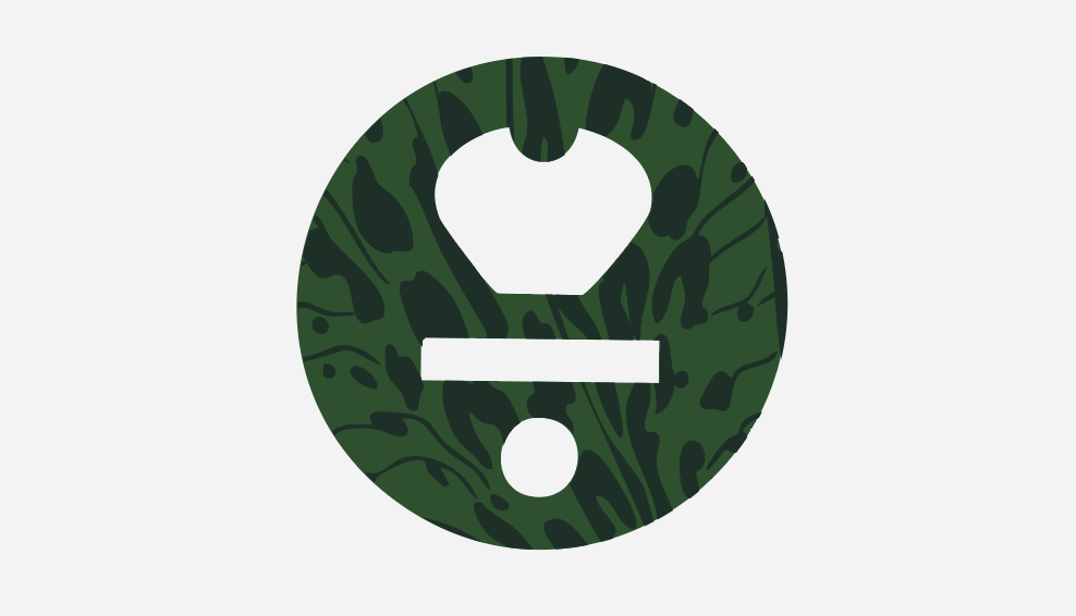
Final Graphics
Design Elements & Brand Storytelling
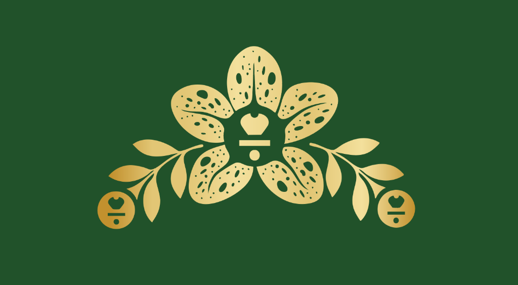
Macro azalea pattern
Reimagines a familiar tradition through innovation
Classic green palette
Maintains the recognizable Masters connection
Traditional typography
Keeps that classy Masters feeling alive
Playful mascot illustrations
Injects L.A.B.'s personality into the collection
Gold detailing and emblems
Gives the product a premium feel